You property management software has a ton of pre-built reports, and almost all of them consist of rows and columns. Most of us are used to these reports, and since this is all we get, we accept them. What if you had the option to do visual data analysis of your property management data?
Visual Data Analysis Makes Sense
Our brains, however, are wired to consume such information visually, and many leading business intelligence tools now have a strong visual component. The image below shows the contrast between the text-oriented report and a visual report representing the same data.
Below are two examples of presenting data visually, one for date-oriented data and the other for comparing quantities. These formats set the stage for visual data analysis.
Date-Oriented Information
A report doesn’t have to be just text presented in rows and columns, like this:
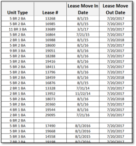
The same tabular information can be presented like this:
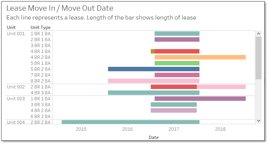
The Move In and Move Out dates are shown graphically. The length of the bar shows the length of the lease, and the position of bar shows which leases start or end earlier than others
Comparing Amounts
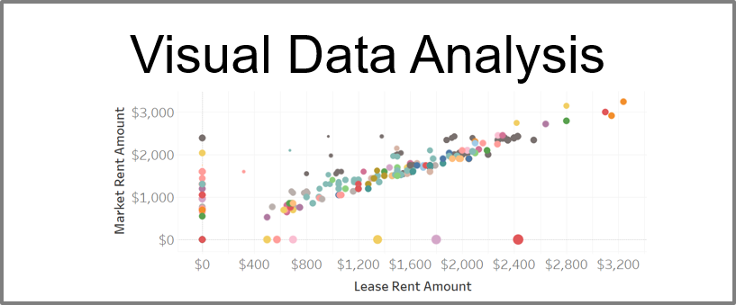
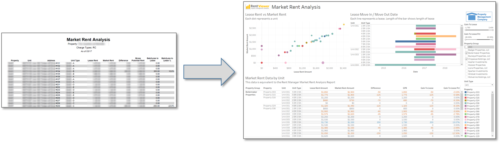
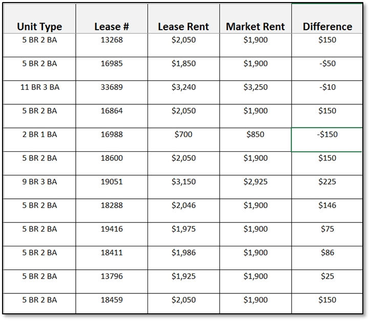
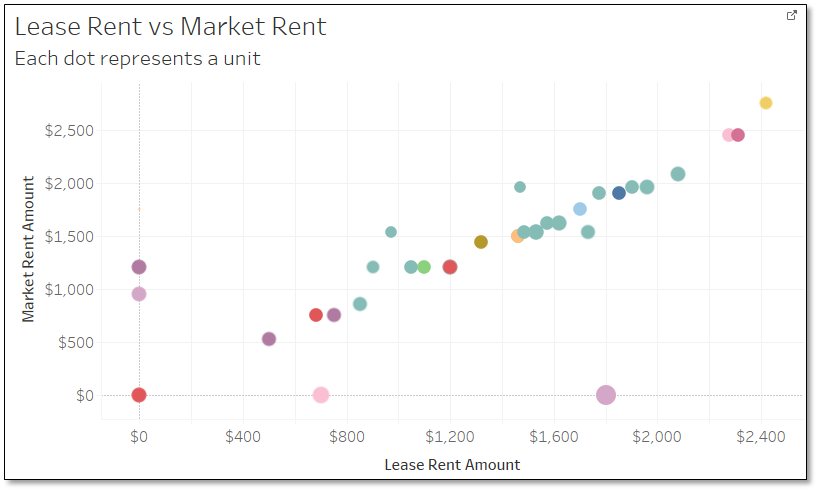
A similar contrast is shown here, when looking at Market Rent vs. Lease Rent for your units.
Here’s the tabular information that is commonly available.
Below is a scatter plot displaying the same information. Each axis shows the rent amount (lease vs market). The dots represent the leases. The position of the dot shows how far apart the lease and market rent amounts are for that lease.
In Conclusion
There are many visual elements available for presenting data, including colors, shapes, sizes, lines and relative sequences and positions.
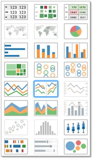
Hopefully this has shown you what is possible. Tools such as Microsoft PowerBI and Tableau are designed to present large volumes of data visually. Below is the selection palette of chart types available in Tableau. There are many options for visual data analysis of your property management data. A video version of this blog post is available on my Youtube channel.