
This post is related to the discussion on how we used analytics to improve maintenance service processes for a property management company. I am going to introduce the box plot and describe when it will be useful to display on your property management dashboard.
You might be familiar with box plots if you dig into stock market data. They are also called “box and whisker plots.” I recently used box plots with a client when we were reviewing data from the Rent Manager Service Manager module. I started the analysis with a review of box plots.
What a Box Plot Looks Like:
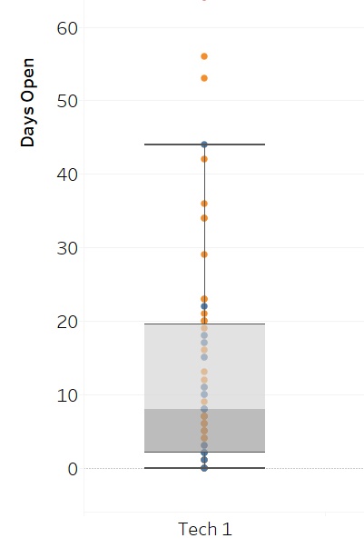
The diagram below shows a box plot. A lot of information is packed into these figures. More details are below. For more information, see this Wikipedia post.
Using Box Plots on a Property Management Dashboard:
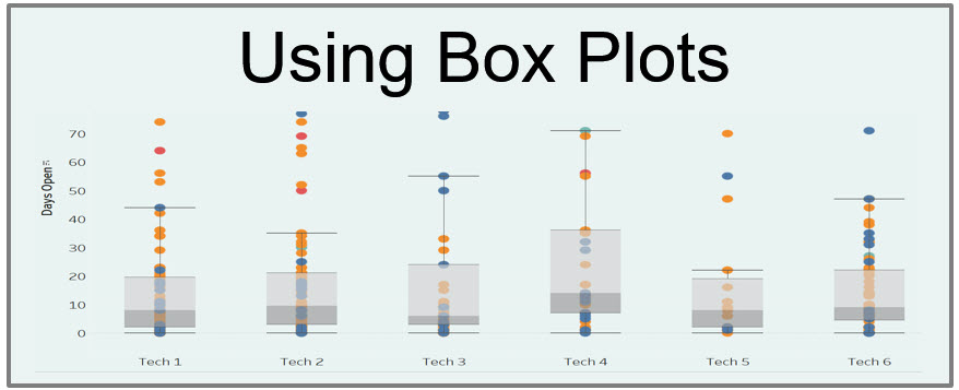
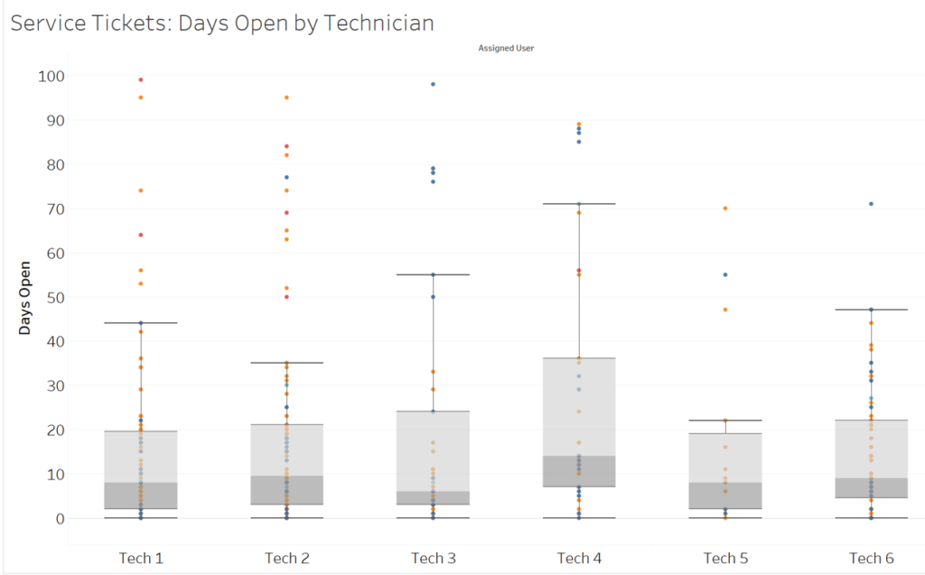
The diagram below shows the initial report displaying ticket information from the Rent Manager Service Manager module. Each “service issue” from Rent Manager is shown as a dot. The vertical axis shows how long the issue has been open (in days). On the horizontal axis, we show the technicians who were assigned tickets. A view like this could be useful to display on your property management dashboard.
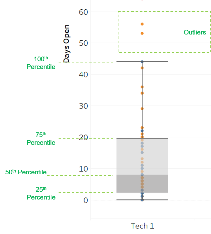
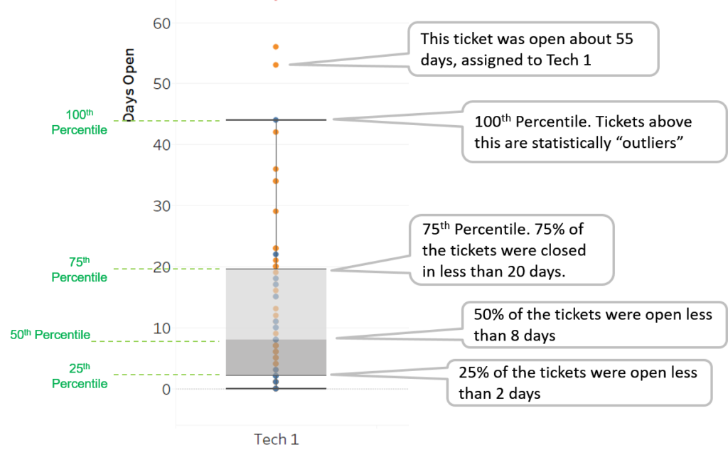
Annotated Diagram of the Box Plot:
See the annotated box plot diagram below for interpreting the box plots.
Look at the horizontal lines on the diagram to get an idea of how fast service tickets are being closed. This data comes from the property management system. The initial reaction is that while the work has been completed, the ticket remains open in the system.
When I Use Box Plots:
When I start a process improvement project, creating a box plot is one of my first steps. This gives me an idea of how spread out the data is. A view like this quickly raises questions about the ticket data and the service management process itself.
The purpose of this post was to introduce box plots. Whether you should display these on your property management dashboard depends on how mature your maintenance service processes are. If the ticket open durations are under control, the charts about might not be useful. It will become clear to you as we look at how we brought one property management company’s maintenance service processes under control using analytics.
