
Before you get too deep in to charts and data visualizations, let’s talk about the concept of variation. Understanding variation is essential for building processes and systems on which you can scale your property management operations.
Once you have succeeded at “variation reduction” your processes will become uniform and repeatable (see post about McDonald’s French fries).
What is Variation in Property Management?
Variation is the change from week to week or month to month in any outcome. Think about metrics such as Rental Income, Number of Vacant Units, Amount Delinquent, Number of New Leads, Number of Leases Signed, Number of Leases Ending in 30 Days etc.
Plot any of these on a chart, and over time none will be a straight line. The ups and downs from month to month in the line show the extent of variation. Statisticians have fancy ways of measuring variation, but there’s no need to go into that.
Looking at Variation in Charts
See the charts below. Plot any metric you care about, and most likely it will fit one of the patterns below.
A. Stable Process With Low Variation
Average = 149

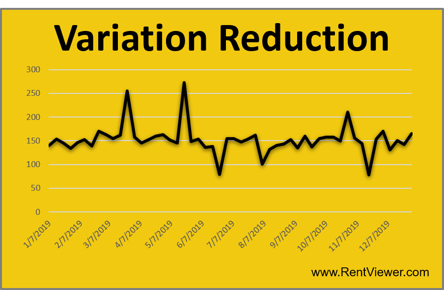
B. Stable Process With High Variation
Average = 152

C. Upward Trend
Average = 193

D. Downward Trend
Average = 112

E. Unstable Process
Average = 151

F. Seasonal
Average = 153

In Plain English, McDonald’s French fries are consistently good. A process improvement expert would say their fries making process is stable with low variance.
Next Time …
Next time you see benchmarking data, such as “Utilities are 5% of operating expense” …. don’t buy it. Ask for the underlying data behind that average.
